Changing my personal logo
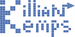
The logo you see at the top of my website has been made three years ago during a work at school called "personal branding". At this time, I wasn't very familiar with tools like Adobe Illustrator and I wasn't very good at graphical work. I will describe in a later post how I designed my new logo with Inkscape, but I will explain here what are the reasons why I designed it like this.
First, people may ask why do I wish to have my own logo when I'm not a company. My use of personal branding is not to be able to do advertising or other form of communication. In fact, I may use this logo only on my website, my CV and my visiting card. So, only mediums that I own. Having a visual identity helps people to distinguish a part of my personality and have a brief overview of my profile. Between a developer having a website styled like a terminal with linux command line entries, and another developer having a website using Google's Material design, you already see there is a distinction between a Linux-fan and a Google-fan developer.
 My previous logo
It took me a lot of time to design my logo. Even with the help of Antoine Beauvillain, who gave me some inspiration and helped me to design the first iterations, it took me more than two weeks to finally know what I want. I may publish a later post on the process of designing the logo and the intermediate logo I got.
So, these are the principles I had in my mind when I designed this final logo:
- Follow KISS principle
- Should not be about coding (even if my blog is a lot about technology)
- Should define me in every domain
After having thought a long time about it, I decided to do something with time. Because in everything I do, I pay attention to time like an obsession and I always try to optimize what I'm doing. Also, I have worked, and am working, on some projects related to time management while some other projects are still ideas on paper.
Trying to represent time, I searched everything which could be related, from watch to sand-glass. But I found all this representation to complex (I remind you that I wanted to follow the KISS principle), so I ended up with this spiral form. The reason is that philosophers like Bergson say that time rolls in itself and I'm really interested to consider time differently as just a cycle. Time is like an undended flow which can't stop.

My final logo after two weeks of research
Well, what are your impressions? I'm also going to redo my website, so you will see a new design in a short time.


A comment?
You found an error in this article? Some advice? You can send a comment by email to "blog at killiankemps.fr" with "[Comment][en][Changing my personal logo]" as subject.
Send a comment by email(The "@" has been replaced by "at" to avoid bad bots to parse the email address)